WEB DESIGN
Pendo developers site redesign
The Pendo developer’s site has been in need of a redesign, to ensure documentation was easy to find, and developer docs were easy to use. The site was lacking in visual hierarchy, had cumbersome navigation and competing elements, and lacked good flow. I designed a solution that made navigating more intuitive, and was structured in a more logical and friendly way. See the redesigned sections below, presented as early concepts.
Created for Pendo, 2021
Helping developers find what they need with a more navigable and scannable website layout
Problem
The site contains five main pages or page types: installation instructions, release notes, APIs/code examples, blog main page, and blog post pages. None of these pages have been visually or structurally updated in at least five years, and was several brand iterations behind. The main problems for the site were structural and functional: it lacked visual hierarchy, navigation was cumbersome, and it required users to jump back and forth and sift through too much information to find what they really need.
Solution
Each of the page layouts were completely re-evaluated, with the main focus on navigation and clear hierarchy. The three column screen view needed to go, and too much visual weight was being put on the non-important areas – or on areas that had too much dead space. By allowing for quick flipping between programming languages on individual code blocks, and creating a more organized side nav with easy filters, developers could ideally find what they needed, faster.
Process
Over the course of about four weeks, I worked on this in the background since we were unsure about timeline and prioritization. I wanted to make sure when it was prioritized, we would have a good foundation. The side nav and each of the five screen types went through several iterations of lo-fi and hi-fi wireframes. I met several times with the manager of technical writing, product designers, and the design team for a series of critiques. This was created before our brand refresh was solidified, so I was able to play with font styling and hierarchy. Several pieces got special attention and went through detailed iterations: each section of the side nav, code blocks, changed/added/fixed labels, the “recently shipped section” on the blog, and tags for blog posts. Ultimately, the project was put on pause because of constraints and unknowns – around who would build it and if enough time and resources could be devoted to it.
Installation instructions
Previous version
Issues to solve for
Cumbersome navigation
No visual hierarchy
Not easily scannable to find what you need
Need ability to change programming language for individual code blocks
Redesign
Solutions
Improved hierarchy with fewer competing elements
Sticky side nav for easy navigation
Less visual clutter to reduce cognitive load when scanning
Ability to switch between languages in code blocks
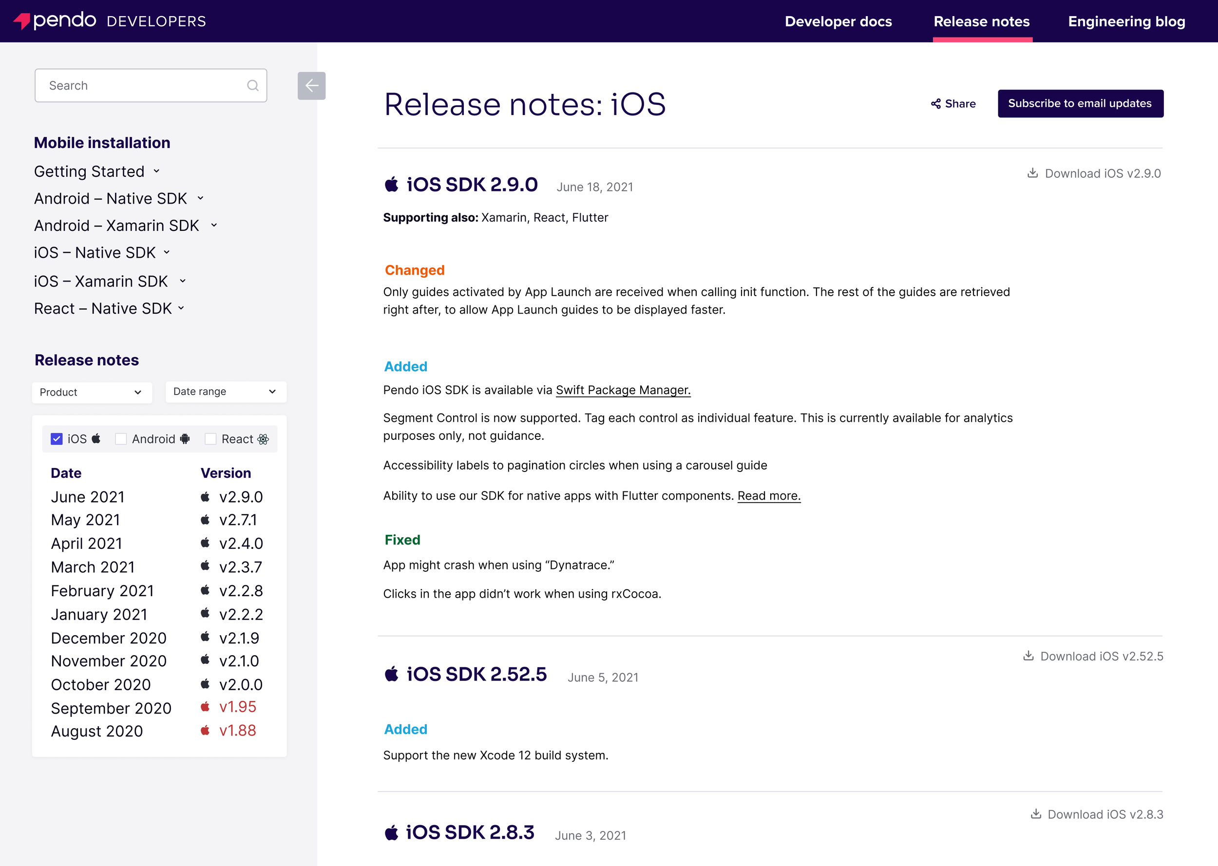
Release notes
Previous version
Issues to solve for
No in-page navigation, competing CTAs
No ability to subscribe to updates
Poor use of space and duplicative labels
Need ability to download version directly from release note
Redesign
Solutions
Sticky left nav to find releases by date, framework, and product
Button added to allow users to subscribe to release updates, and share with team
Improved organization by creating sections for Changed, Added, and Fixed
Download button added at right of each version’s release note for easy access
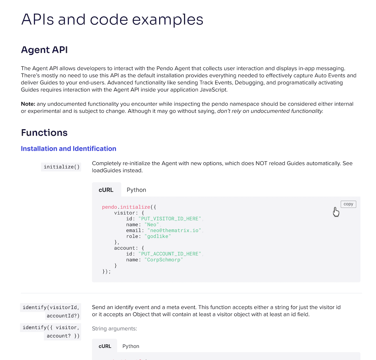
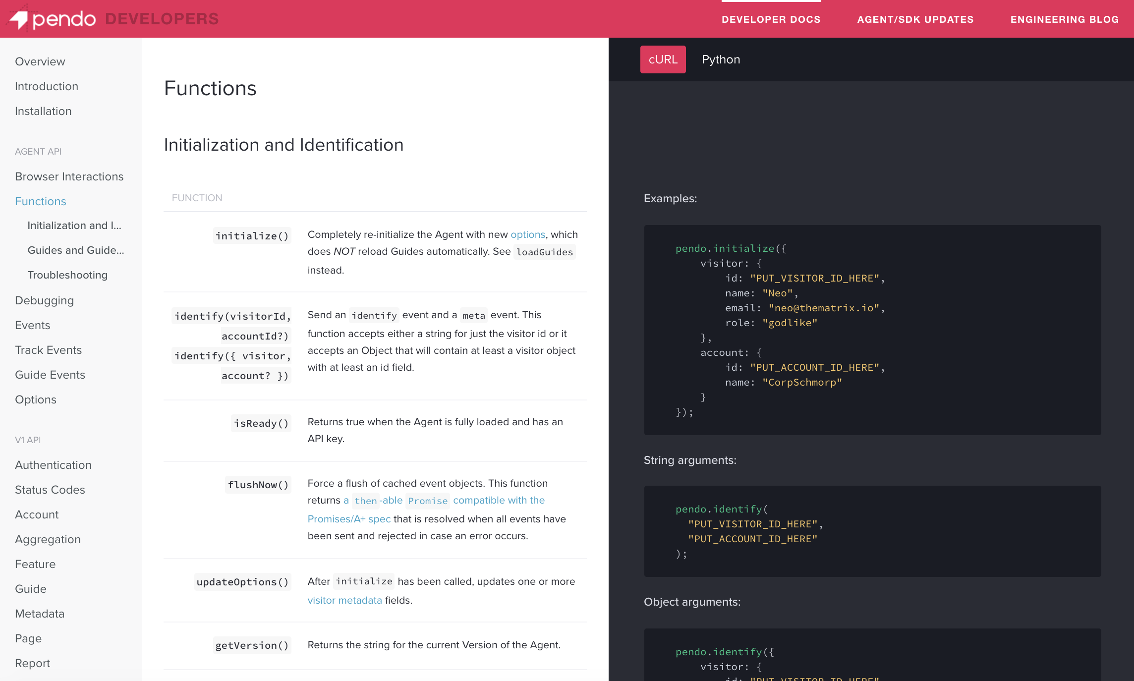
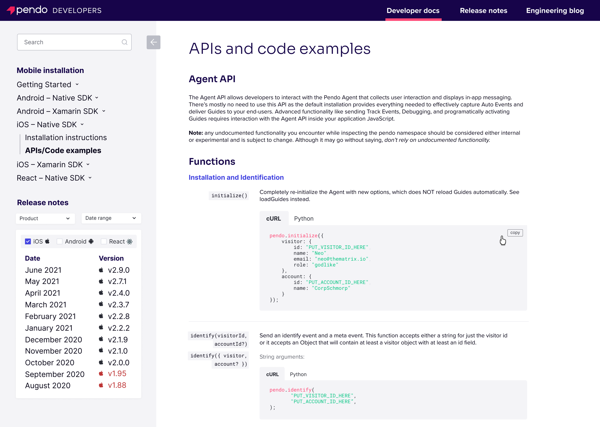
APIs/code examples
Previous version
Issues to solve for
Split screen forces user to ping-pong back and forth
Code examples separated from function
Need ability to change language for individual code blocks
Dead space in code column if on portion with no example
Redesign
Solutions
Code elements tucked under functions
Ability to switch between languages in code blocks
Parity with code blocks on installation page
Improved use of space by adding inline code blocks
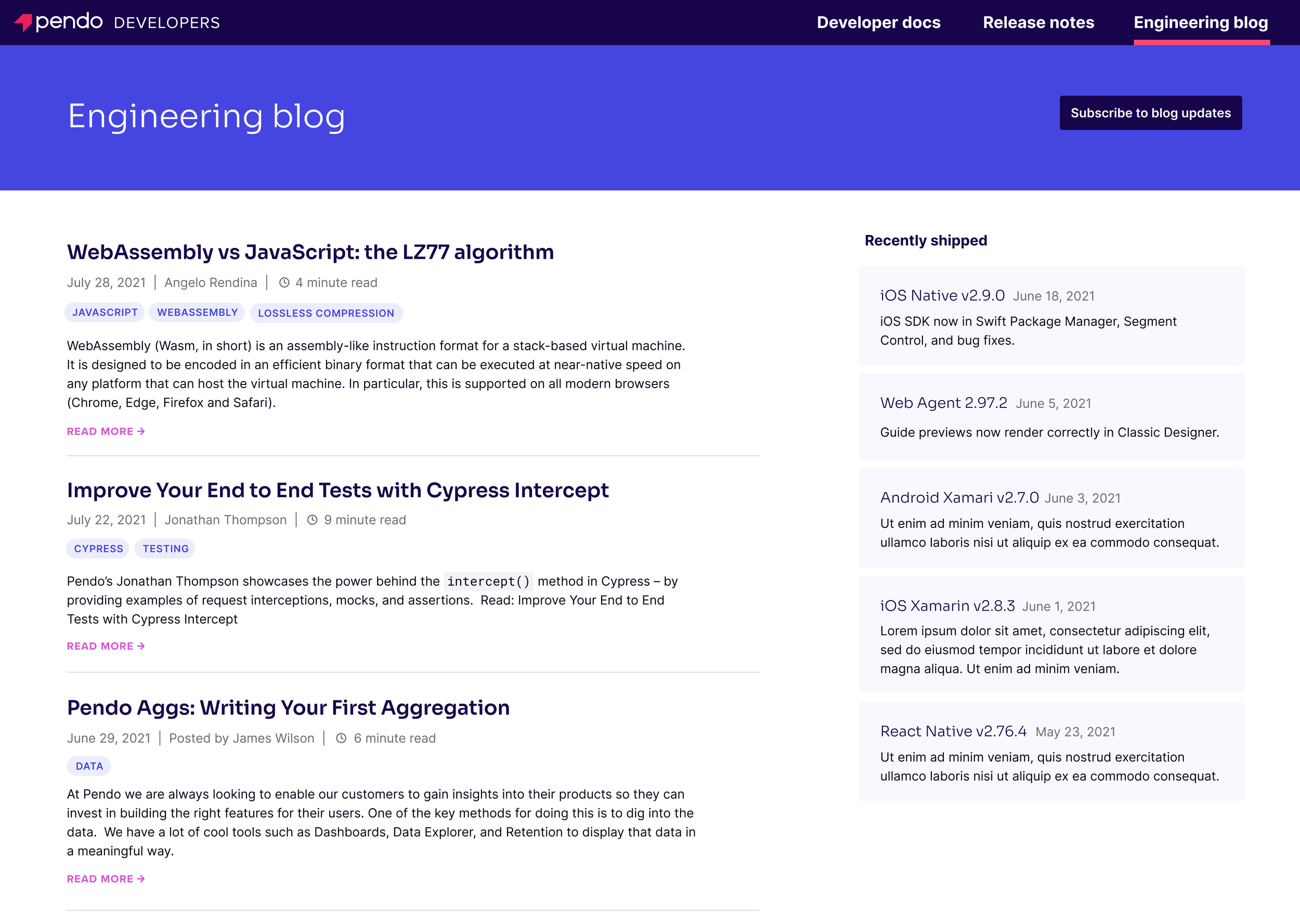
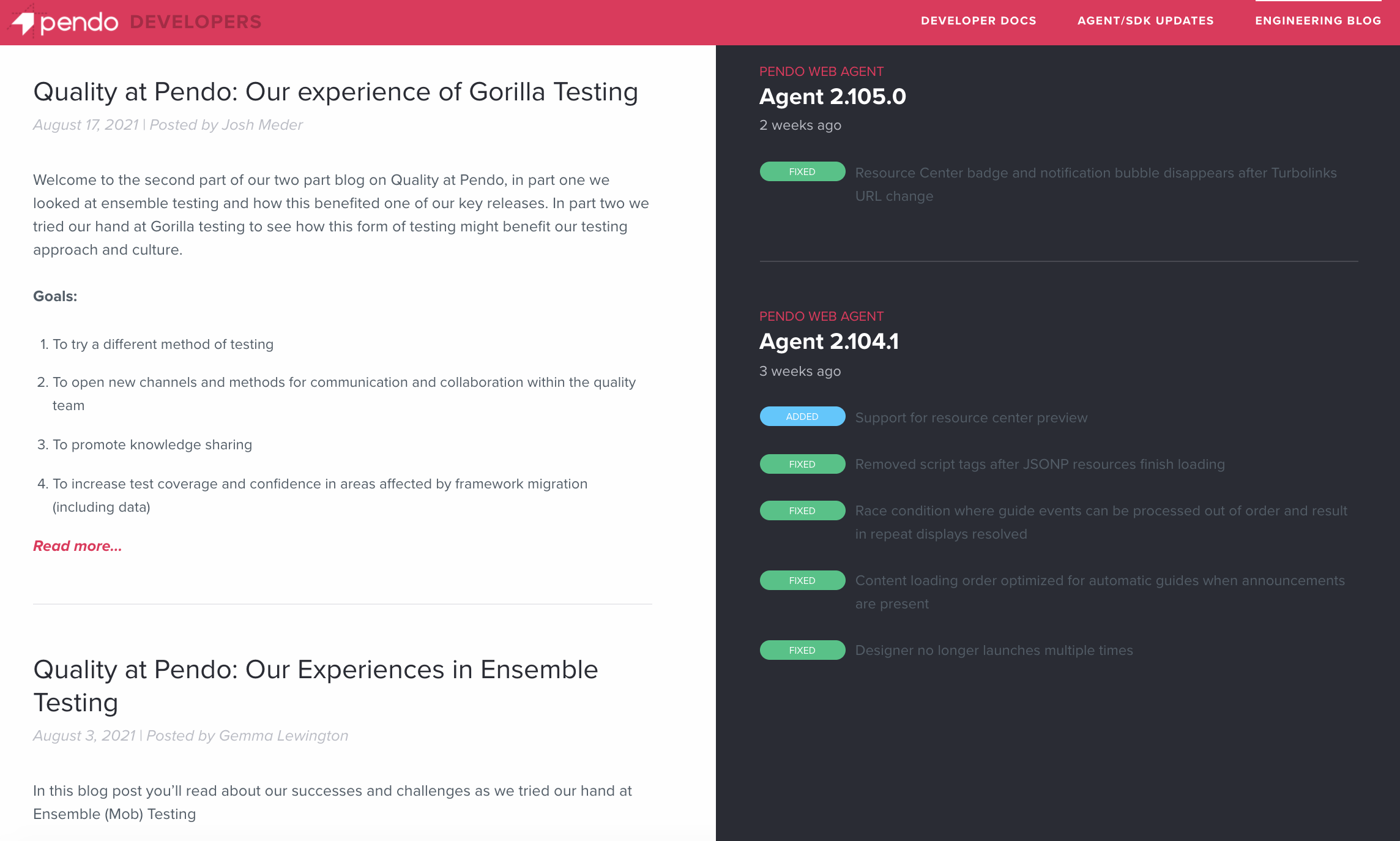
Engineering blog
Previous version
Issues to solve for
Recent releases section overshadowed blog content
Topic covered in post aren’t obvious without reading preview
”Read more” CTAs not cohesive with rest of Pendo site
Date and author section needs improvement
Redesign
Solutions
More subtle visual treatment for recently shipped releases
Topic tags for each post in addition to preview
”Read more” CTA made cohesive with rest of website
Removed “Posted by,” added indicator for length of article
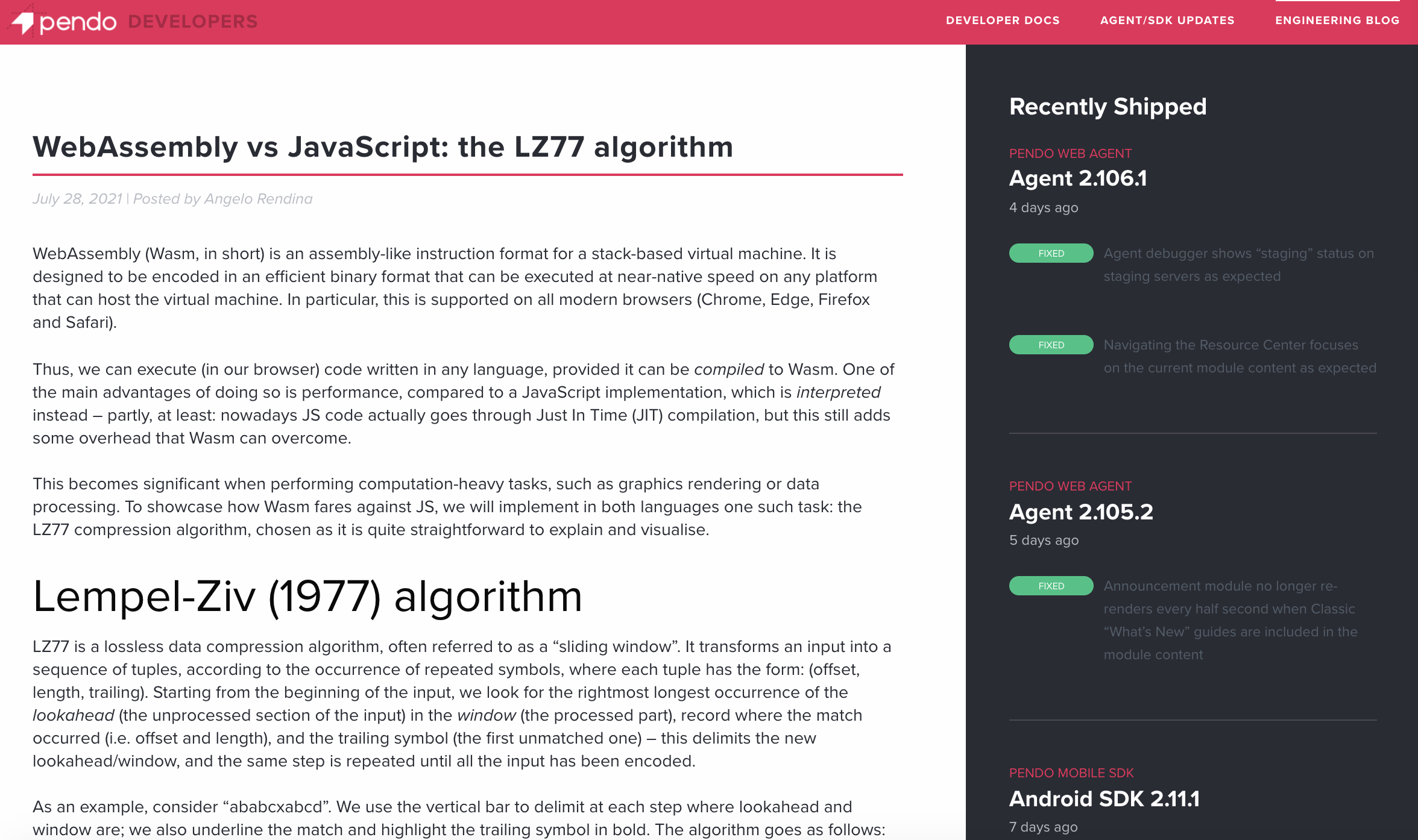
Blog post template
Previous version
Issues to solve for
Poor hierarchy between post title and section titles
Date and author are inaccessible color
Recently shipped section overshadows post content
No ability to subscribe to updates
Redesign
Solutions
Improved visual hierarchy between post title and section title
Darker color for date and author, added more information in heading
More subtle treatment for recently shipped releases
Added subscribe option
Creating a better website layout for easy navigation and scanning
Outcomes
Ultimately, the project was put on pause due to resource constraints. However, building out each page, and keeping iterations and notes in tact in the Figma file, put the project in a place where a good foundation has already been established. This was especially important since I was the sole designer on this and in these conversations while on the brand team, but with my switch to product it will be handed to someone else.
Wishes
My main wish was being able to see this project through to the end. But, it highlighted the importance of keeping my work and thought processes in a state where another designer can pick up where I left off if need be. Because I began working on it early and then pressed pause, I did not get to meet with enough developers or do any user testing, which will be a critical part of the success of this site once it is rebuilt.
