BRAND + DATA VIZ + WEB
The 2021 state of product leadership report
Pendo produces an annual State of Product Leadership support, which surveys people who work in Product across the globe. In 2021, three versions were published: Global, Europe, and Japan. A visual theme was produced for all of them, with variations for each geography.
The project entailed a graph-filled ebook, landing pages, animated charts for the landing pages, and promotional images and videos, as well as translated versions in French, German, and Japanese.
About the company: Pendo is software that helps people adopt software more quickly and successfully, using analytics, in-app guides, and feedback.
Created for Pendo, 2021
Charts on charts on charts
Overview
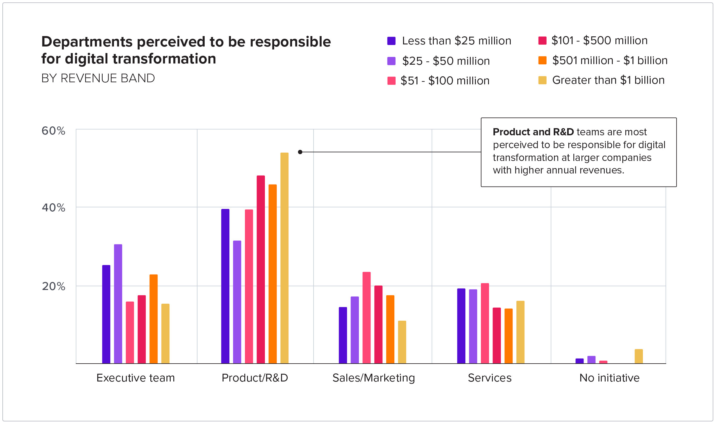
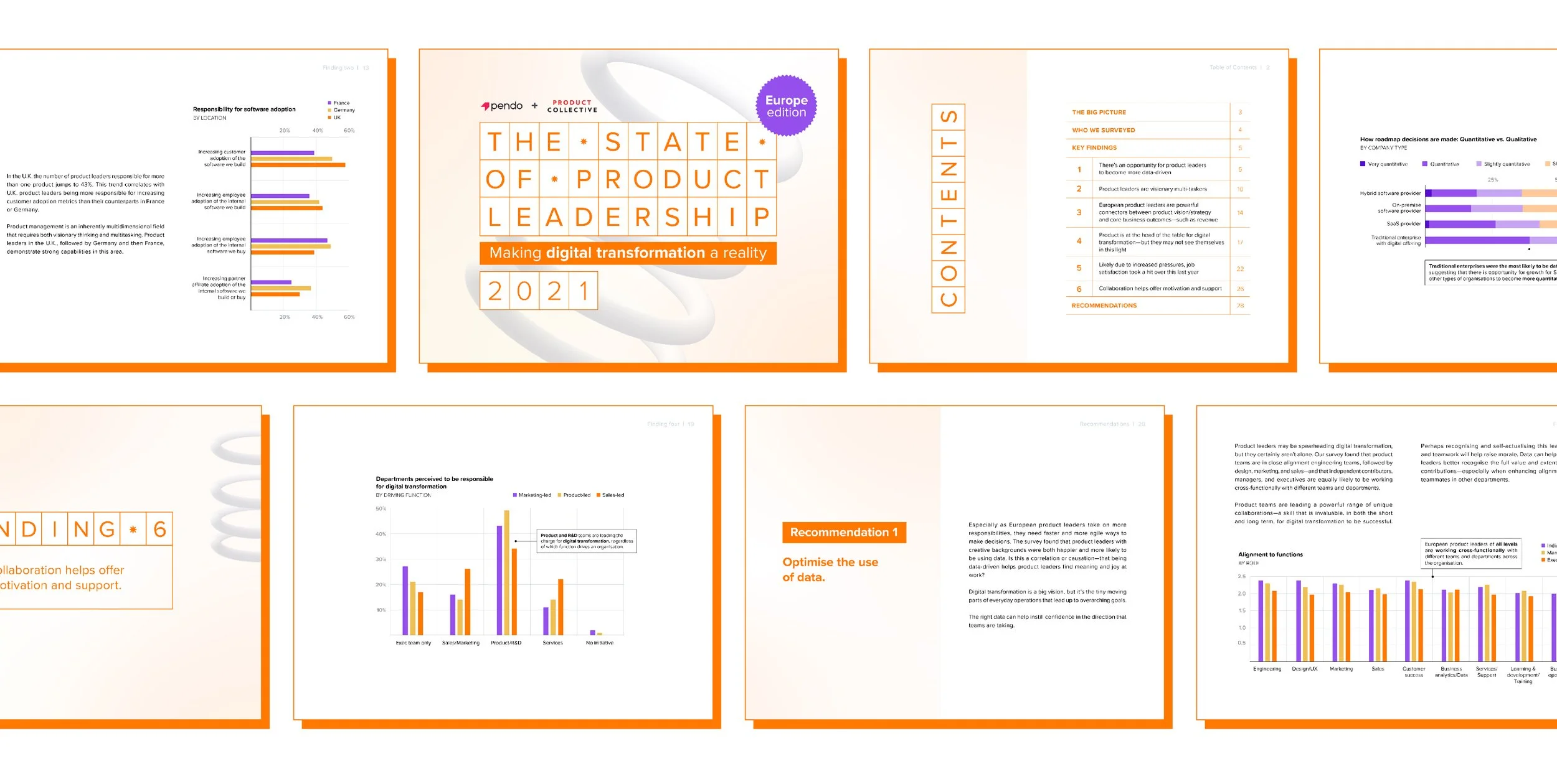
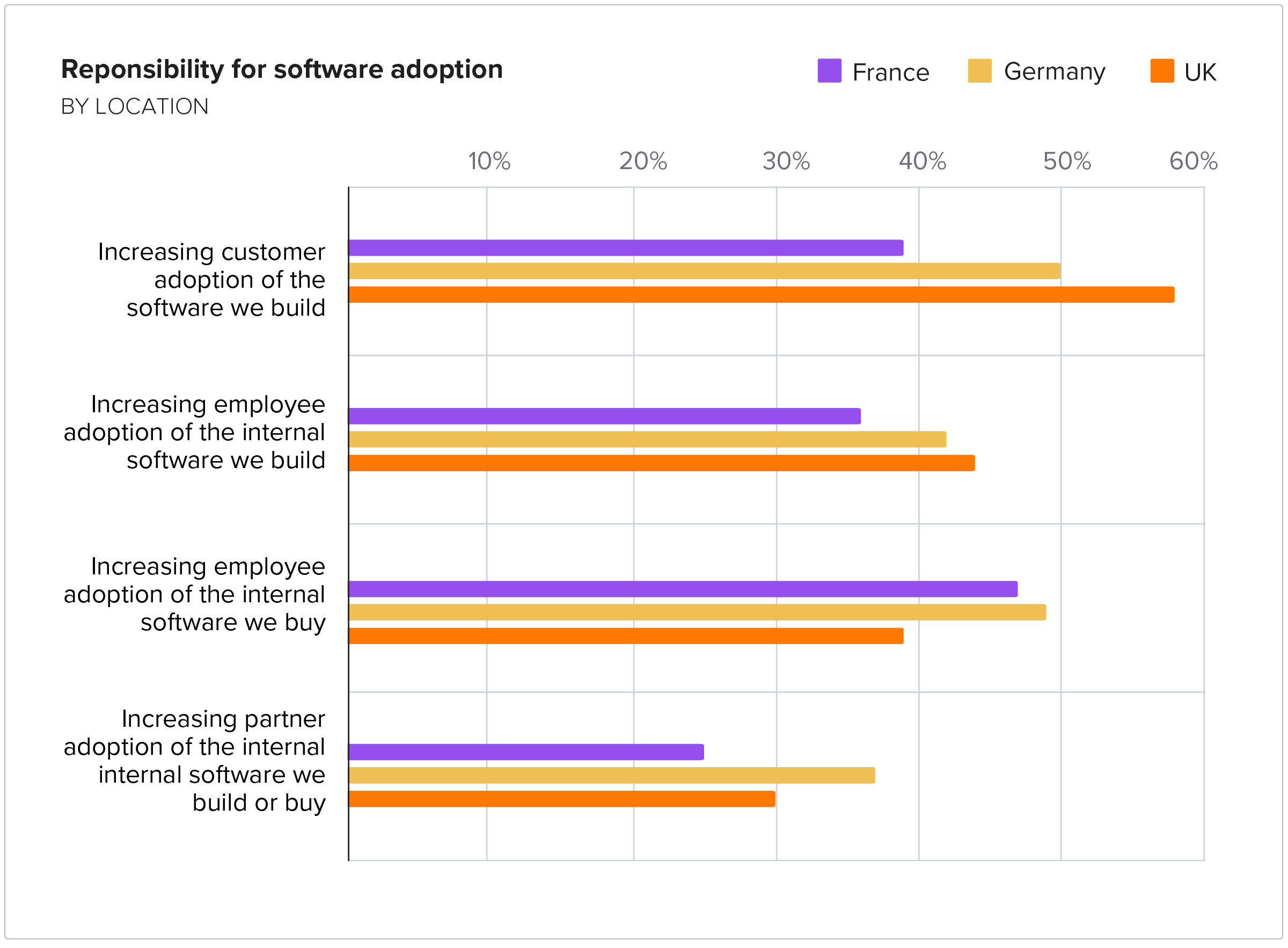
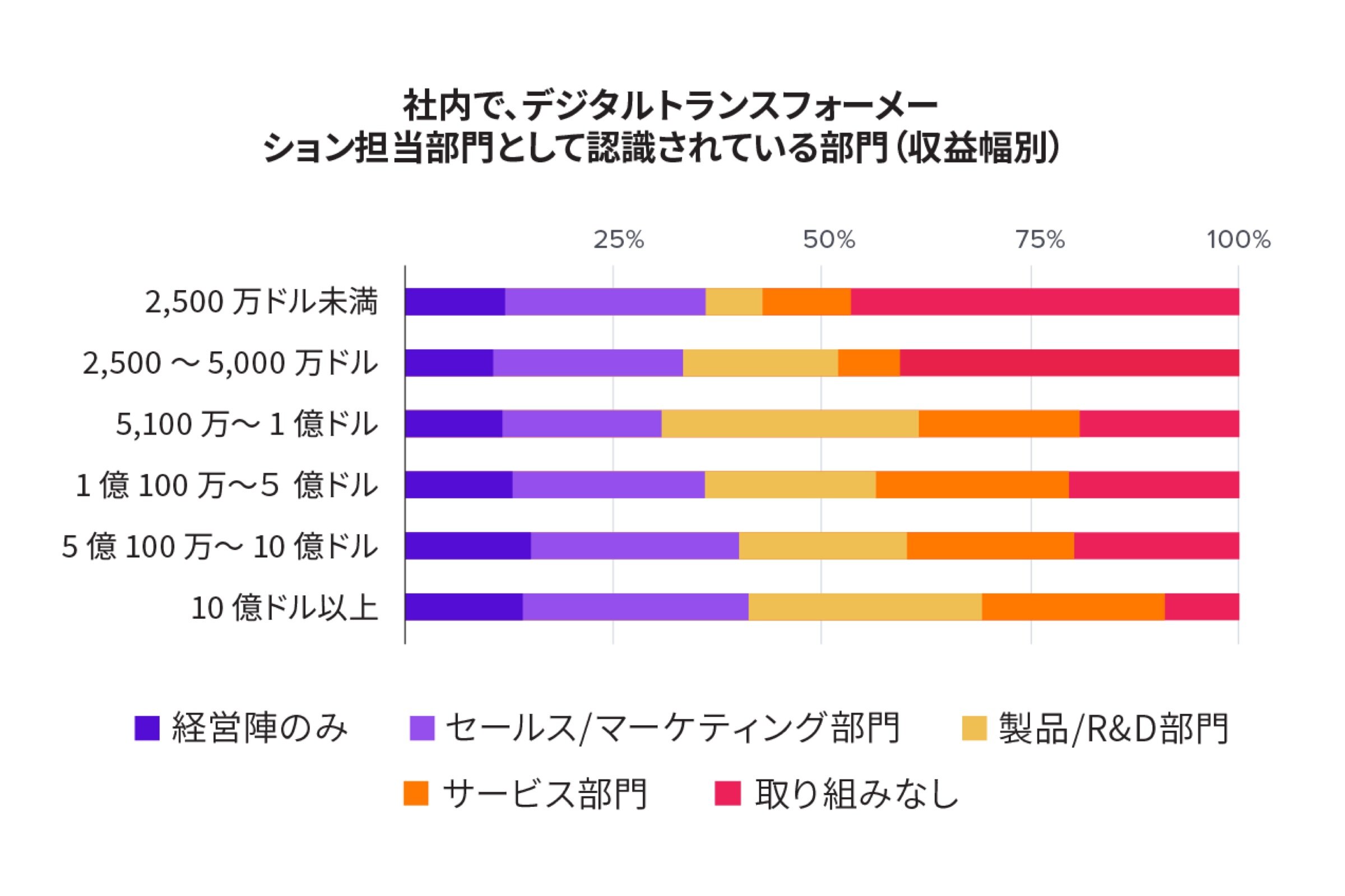
Every year, Pendo produces a “State of product leadership” report that surveys product practitioners across the globe. 2021 would be the first year series would include a Japan edition, in addition to the global and Europe editions. The report consists of series of key takeaways supported by charts and data, and recommendations to conclude the report. In addition to the ebook, there are website landing pages, web versions of the content, animated social promotions, and paid ads. I will highlight each of the editions below.
Process
Every year, this is the largest report we produce, and the most involved. The data analytics team helped synthesize the data, producing basic charts and tables that I can use as a general guide. A content writer is responsible for the report, and I work with them to ensure the placement and design of the charts highlights the narrative.
After inputting copy from the Google doc into InDesign and putting placeholder charts in the file, I set up once or twice weekly meetings with the content writer to go over iterations of the ebook. This helped minimize the back-and-forth of reviews and helped the project stay on track. The total timeline for the project was about four weeks.
I created the art direction for this project, and a system for each of the editions to feel cohesive but distinctly different. Because at that point we did not have a set template for ebooks, I was able to be a bit more creative with look and feel, and I brought the concepts to design critique several times.
Considerations
During the course of the project, I asked myself (and my content partner) the following questions: How can the three editions feel distinct but also part of the same system? How can we bring focus to important takeaways on the charts? How can I structure each page in a way that balances written content with charts? How can I make the graphs feel: modern, approachable, authoritative, and easy to scan/read? What set and balance of brand colors should I use for each edition and for the charts? How can I get feedback early and often so that we don’t have last-minute changes or opinions during our short timeline?
Global edition
Ebook design and layout, graphs (both static and animated), and landing page
View SOPL 2021 Global landing page live here.


Europe edition
Ebook design and layout, graphs (both static and animated), and landing page
View SOPL 2021 Europe landing page live here.


Japan edition
Ebook design and layout, graphs, and landing page
View SOPL 2021 Japan landing page live here.


