PRODUCT
Big little updates to Pendo analytics
A collection of items usability items for Pendo analytics. Items prioritized these items based on customer feedback, data, customer research, NPS and SUS poll responses.
Created for Pendo, 2022–2024
Introducing 20+ little usability items with big impact in Pendo analytics
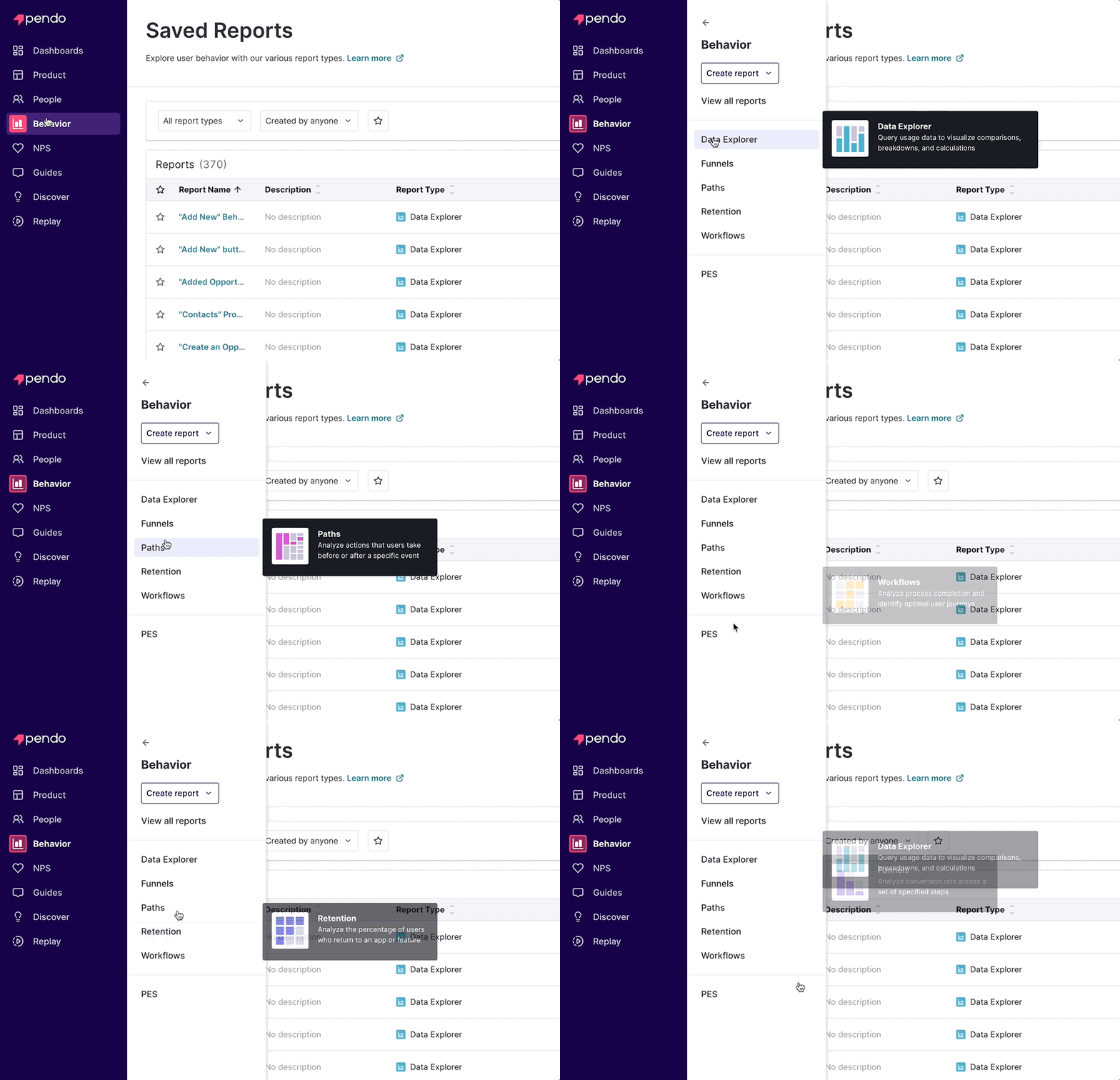
Refreshed navigation
We’ve got a new look! Our navigation now looks and feels more like our brand. Keep it expanded or collapse it for a wider working area. We also added some helpful tooltips, quick create buttons, and direct links to report list pages.
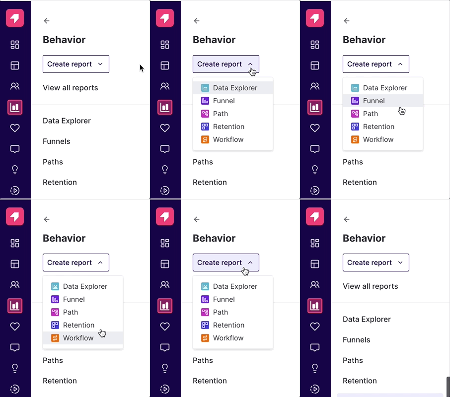
Quick creation of reports from navigation
Create any report with just a click from the navigation. Just simply select “create report” in the behavior section, and you can choose from Data Explorer, Funnels, Paths, Retention, or Workflows without having to go to the list pages.
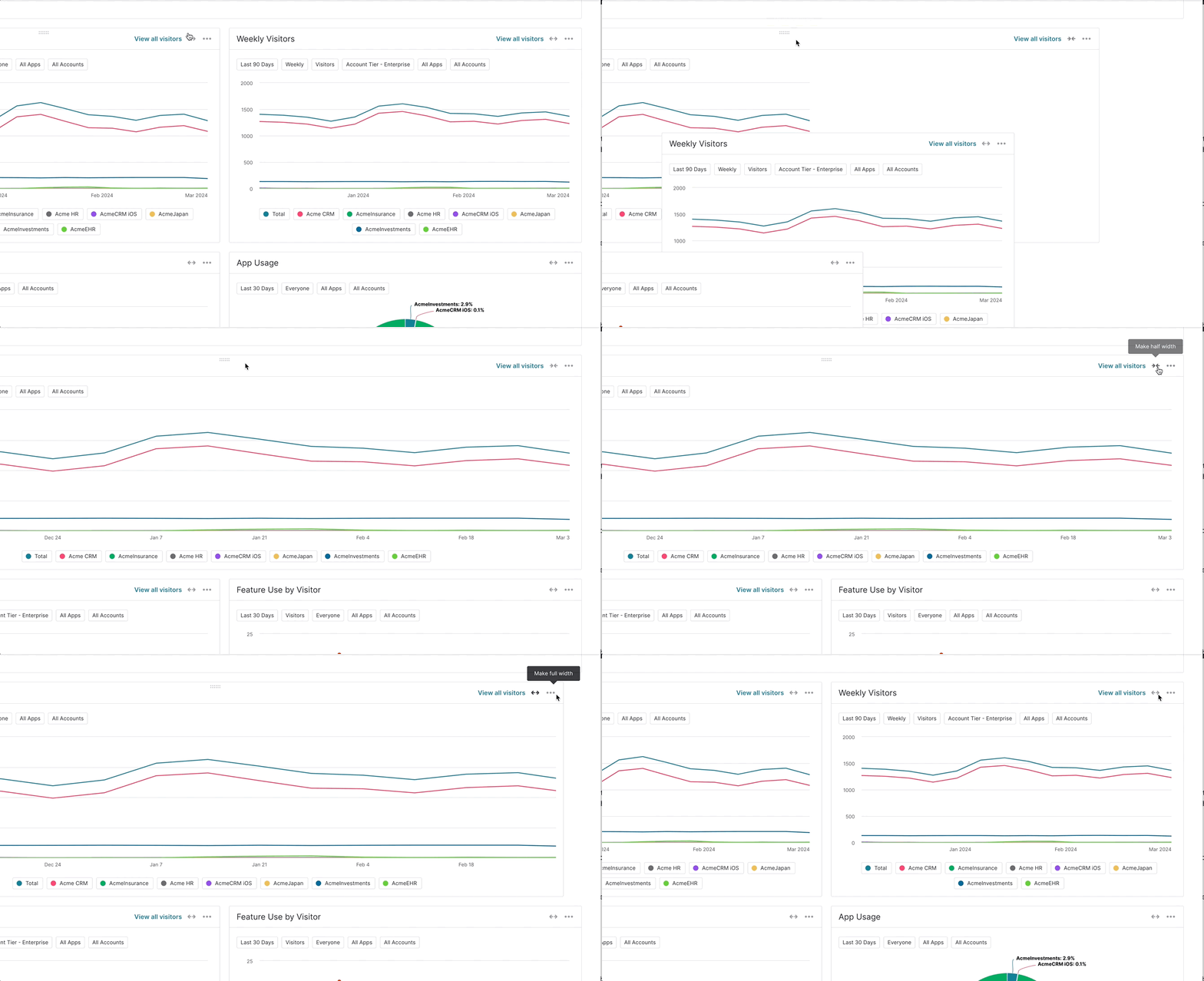
Resize your dashboard widgets
Create structure and hierarchy on your dashboard by resizing widgets to either half of full width. They’re no longer constrained to their default size, which also means those Data Explorer charts can sit side-by-side with another report or a text block.
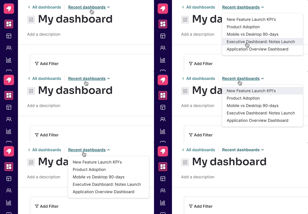
Recently visited dashboards are a click away
Easily access recently visited dashboards while on another dashboard, or see the dashboards list without having to use the navigation bar. Your top five recently visited dashboards will be just a click away.
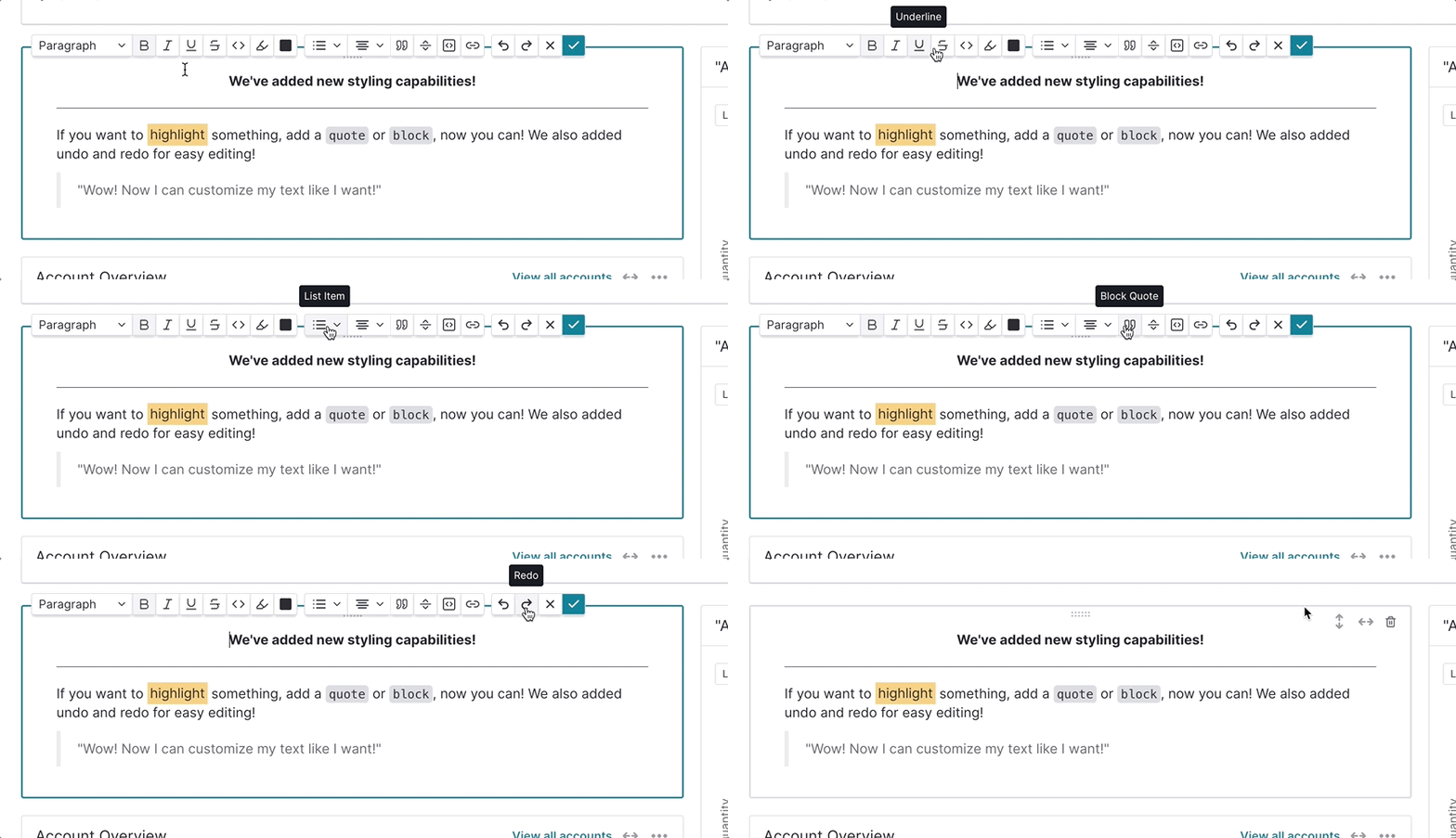
More options in text widgets
We’ve added over ten new capabilities to the text widget. Together with the ability to both horizontally and vertically resize this text widget, you will now be able to add structure to your dashboard by having centered section titles and horizontal rules, context beside charts, customer quotes, create checklists for in-flight product releases, and more.
Full list of additions: Strikethrough, code styling, code block, highlight, checklist, alignment to center, right, horizontal rule, quote, half + full width, half + full + flexible heights
Set a dashboard as your homepage
Set a dashboard to be your homepage when you log into Pendo. In the middle of a feature launch, or want to monitor your area’s KPIs every time you log in? Set as home and always be able to access by clicking the Pendo logo in the nav to take you there.
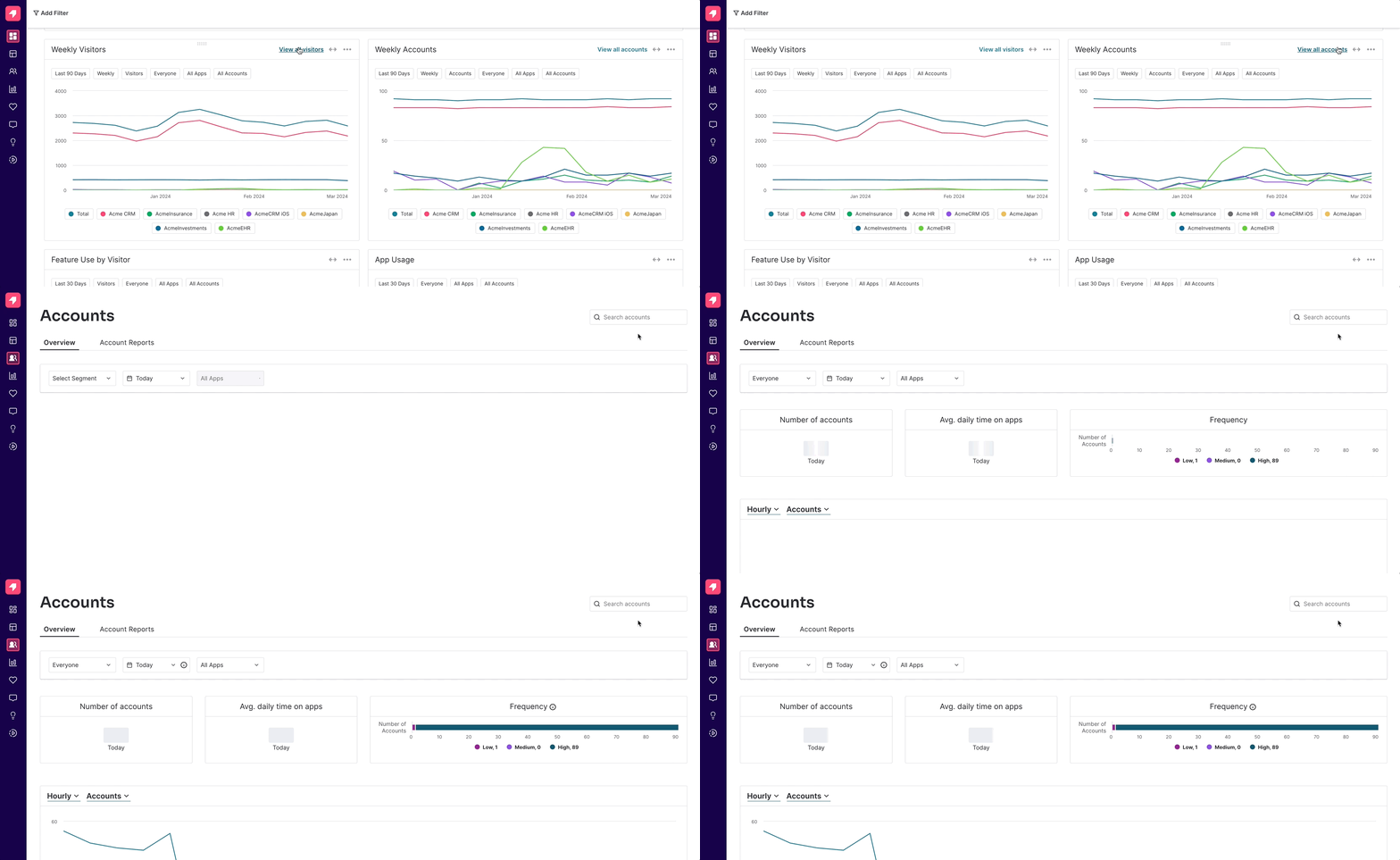
Click through to more data from dashboards
See a data point or item that you want to dig deeper into? Now just click on the link in the upper righthand corner of a widget to take you to the relevant page– whether it’s accounts, visitors, PES, guides, reports, etc.
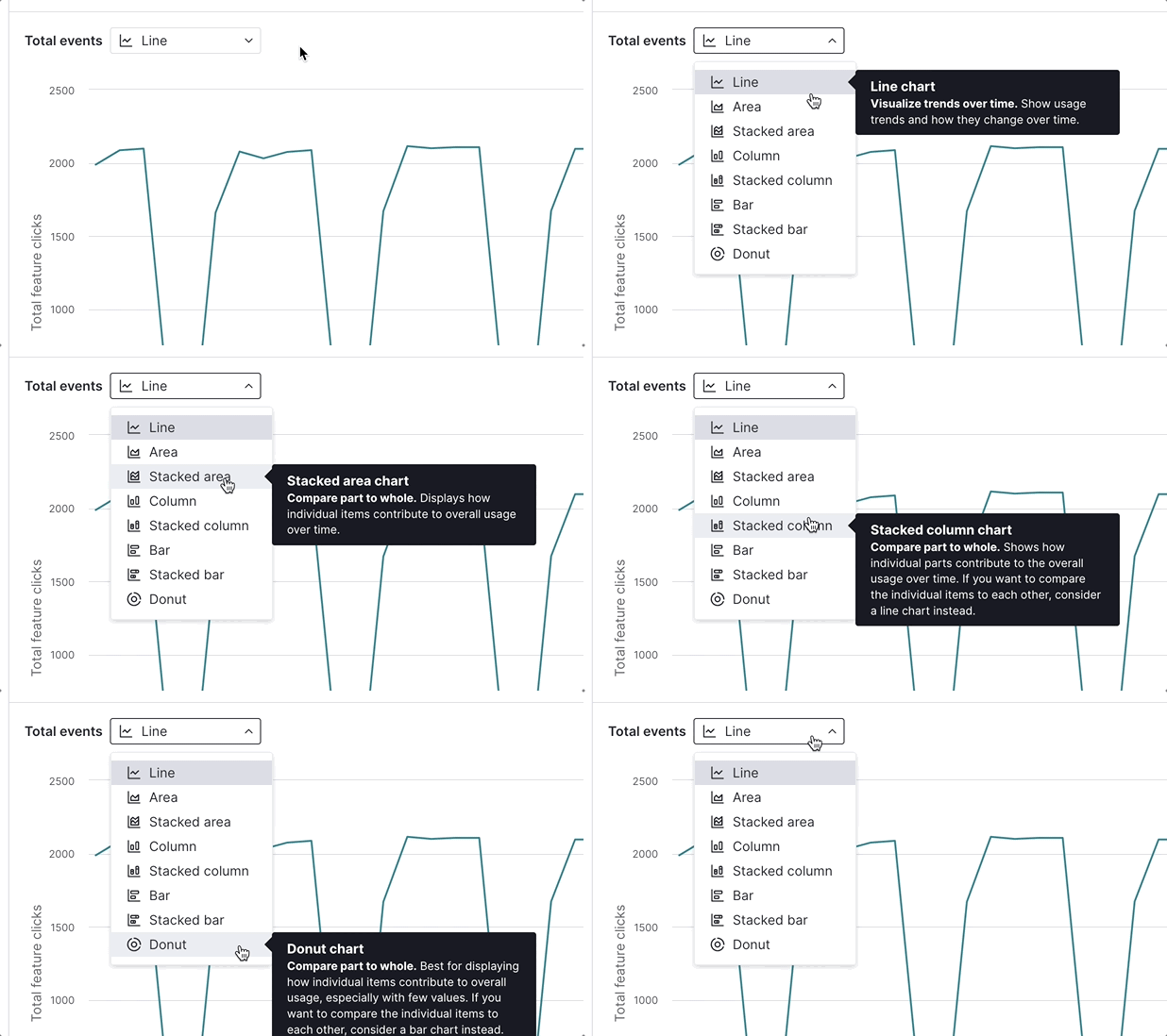
Enhanced chart selection in Data Explorer
Confidently display your data with improved chart selection in Data Explorer reports. Not sure what type of chart is best for your data? We’ve got you– just read the descriptions we provide for each chart type.
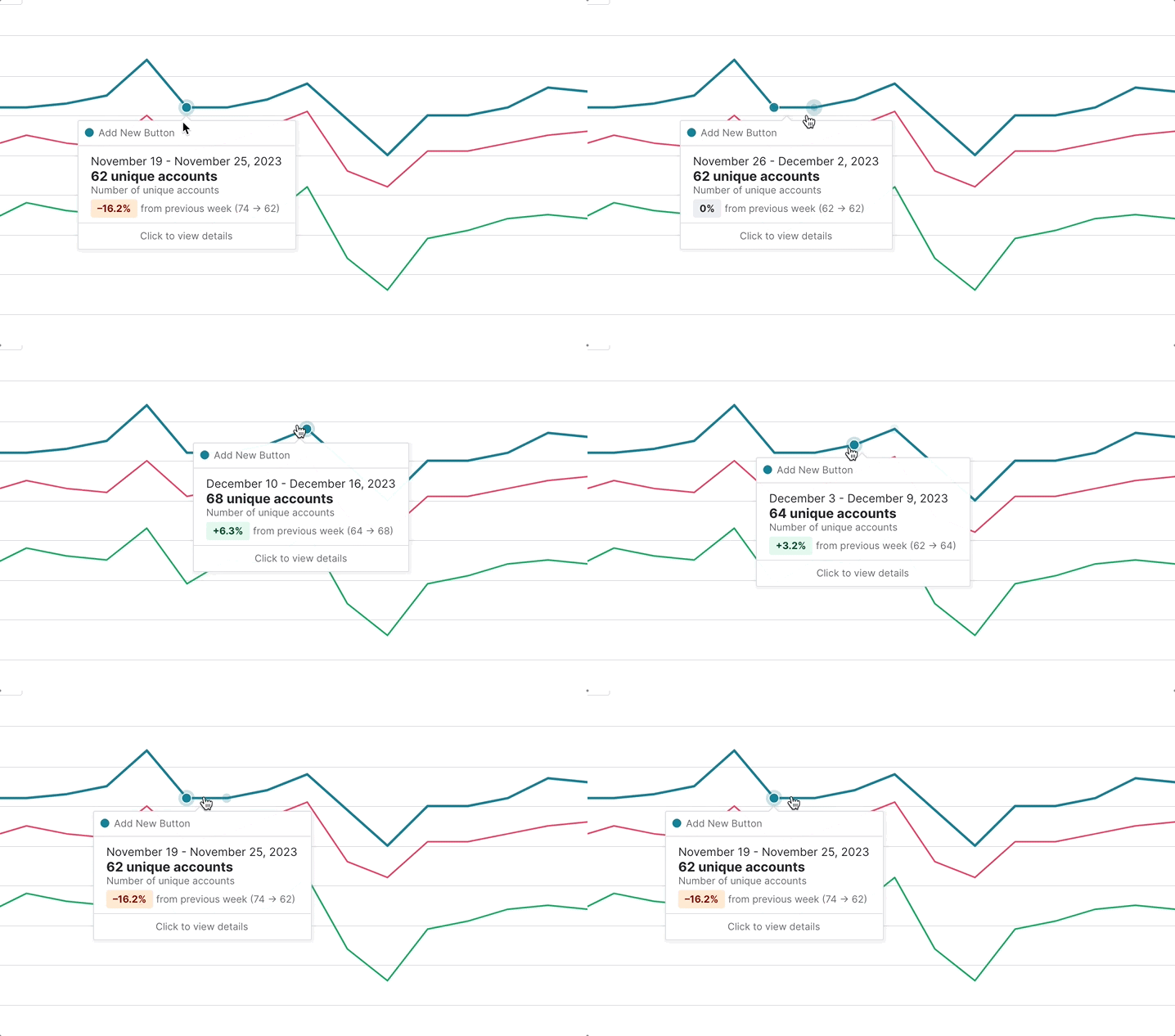
See trending information on line charts
Forget using excel or a calculator –– you can now see trending data in all tooltips for time series charts throughout the application. Understand what % your data has increased or decreased month over month, or week over week.
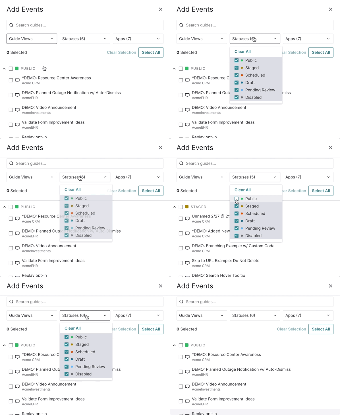
Filter by guide status in Data Explorer
Finding guides in Data Explorer is now easier than ever with the ability to filter by guide status, and see guides grouped by status in the event selection blade. We’ve put the public guides at the top so you can quickly access the most relevant ones.
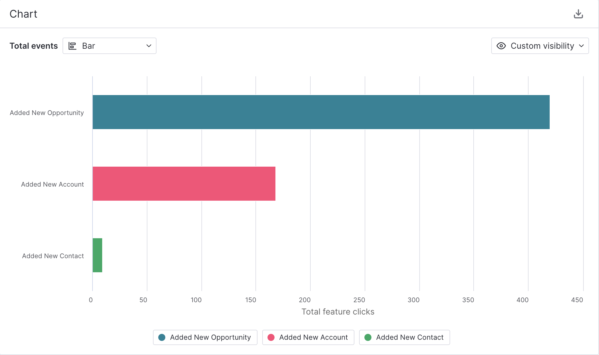
Sorted bar charts
Bar charts are now sorted in descending order by default in Data Explorer. Whether you are in custom visibility mode or dynamic top 10 mode, your horizontal bar charts will be sorted from greatest to least for easier comparison between items.
Recently accessed reports
Easily access your recent reports from the report list pages or from an individual report page. We now surface recents at the top of the report list pages so you can jump back in, and your top five recently visited reports are also just a click away when you are on an individual report.
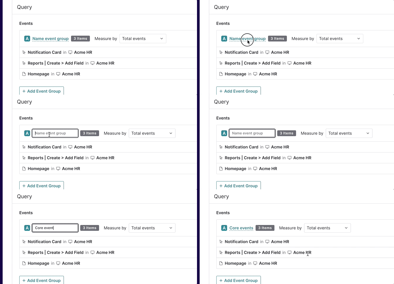
Name your event groups in Data Explorer
We know “Group A” and “Group B” don’t mean much when you are analyzing your data, so we have added the ability to name your event groups in the Data Explorer query. When using formulas, this will also allow you to see this name in the plain language question format, allowing for more tailored analysis and context– not just for you, but for whoever views your report or chart.
See owner and edit information on every report
Always know who owns the report you are viewing or editing, and when it was last changed. This information is now on the individual report pages, not just the reports list table.
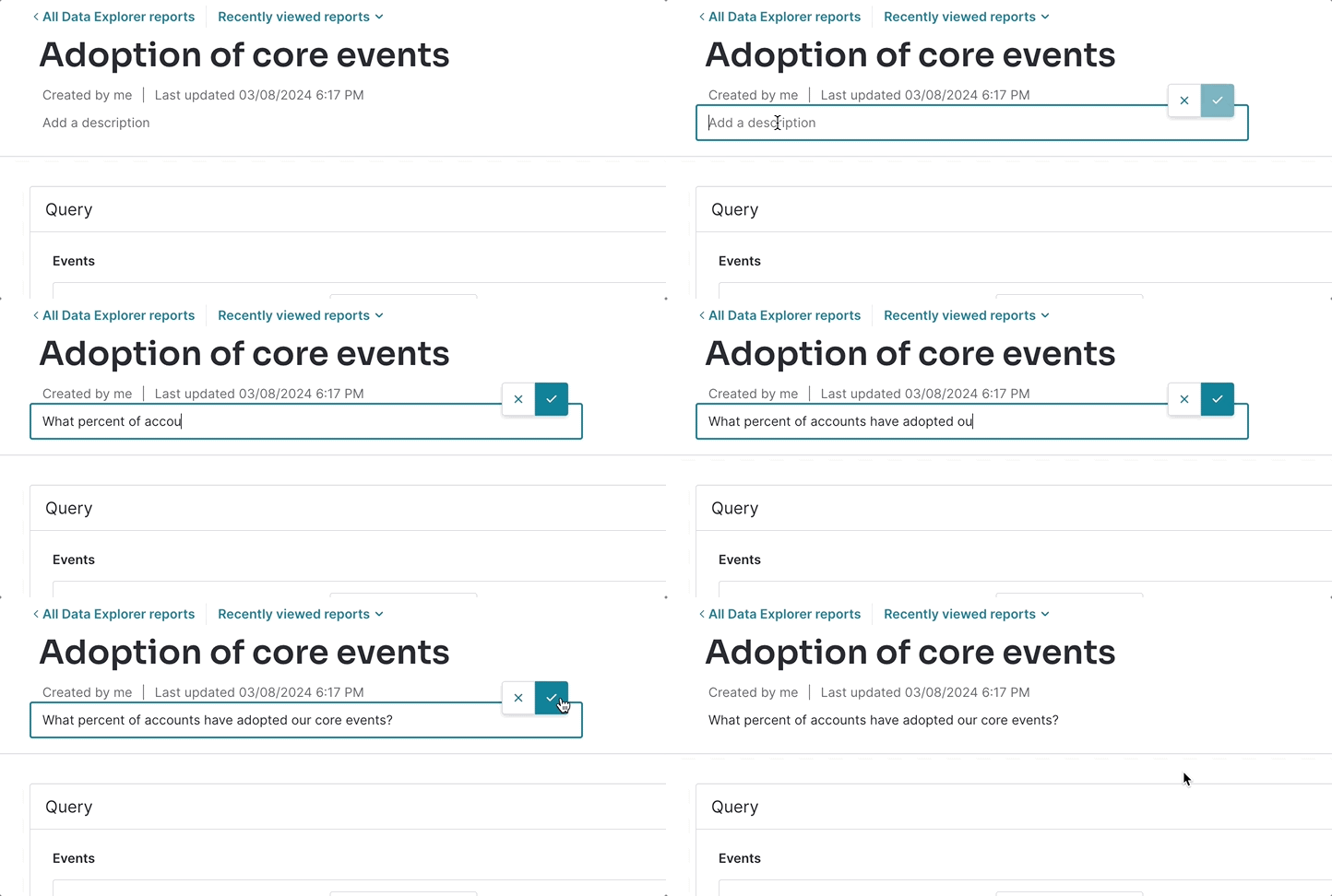
Add more context to your reports
Add more context to your report with report descriptions. Use this space to frame your data with the question it answers, additional context to the data, when something shipped, the audience, or any other information that helps communicate your data more effectively.
Easier date comparison
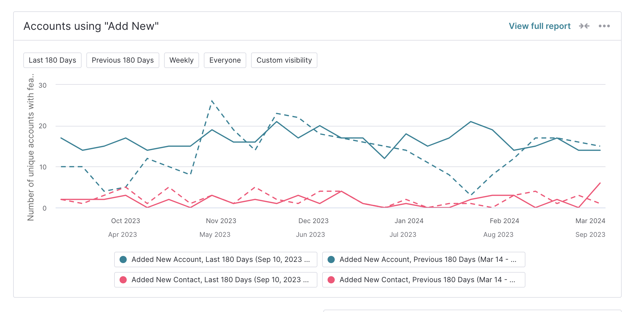
More easily compare items to each other, or to the previous period with this simplified color logic. When using date comparison in Data Explorer, we no longer assign different colors for each series plotted, regardless of if it’s current or previous period. We now assign both periods the same color, and use a dotted line for the previous period.
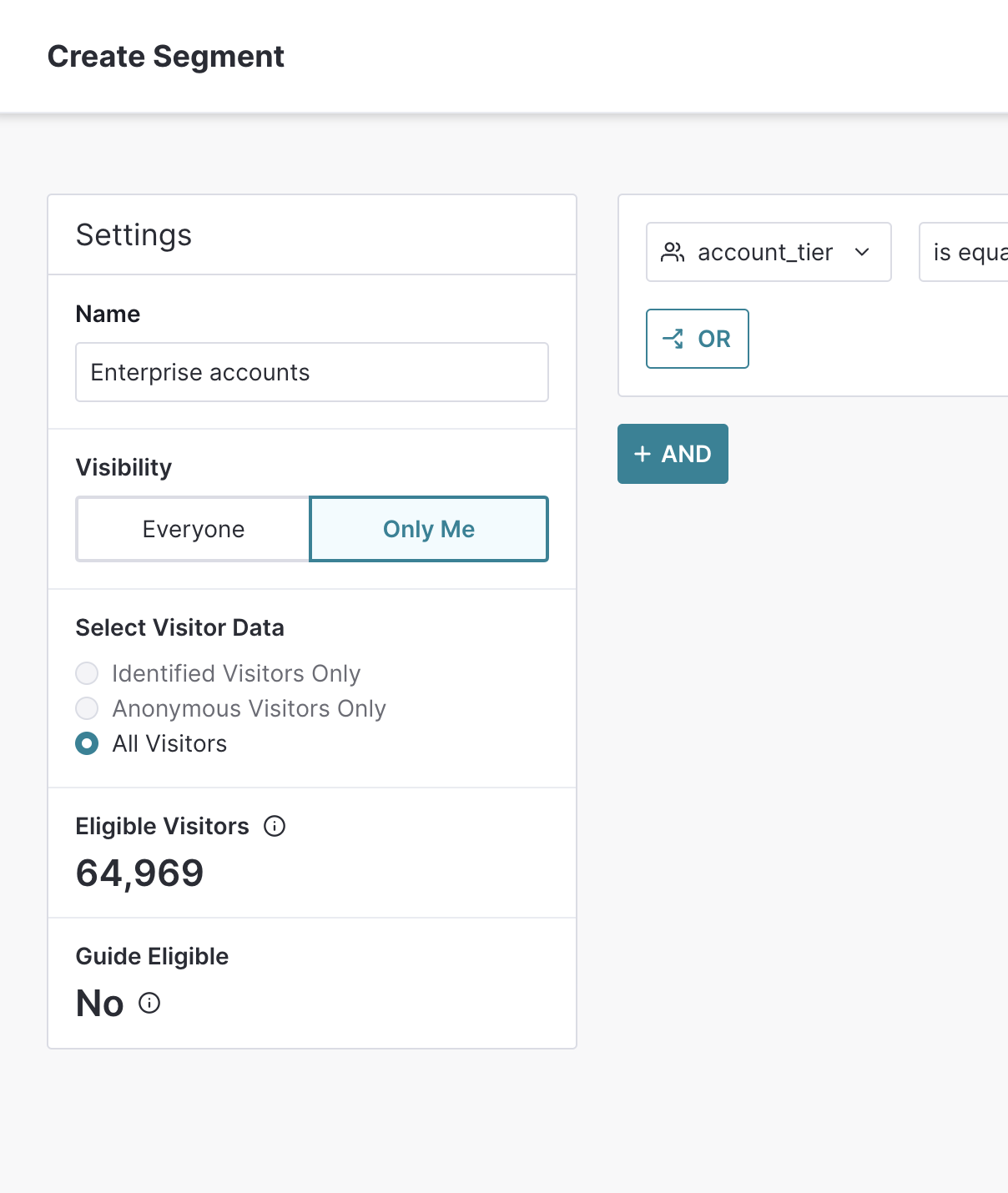
Eligible visitors count and
guide eligibility in segments
See how many eligible visitors exist for the segment, whether you are in the segment editor, the draft segment editor in reports, the custom segment editor in guides, or in the segment details blade. The count will update in real-time as you edit your segment rules. This count will help you understand the size of your audience whether you are filtering data or targeting a survey.
And, understand whether or not a specific segment is guide eligible or not, and why. See this information in the segment editor, and in the segment details blade.
Coming soon
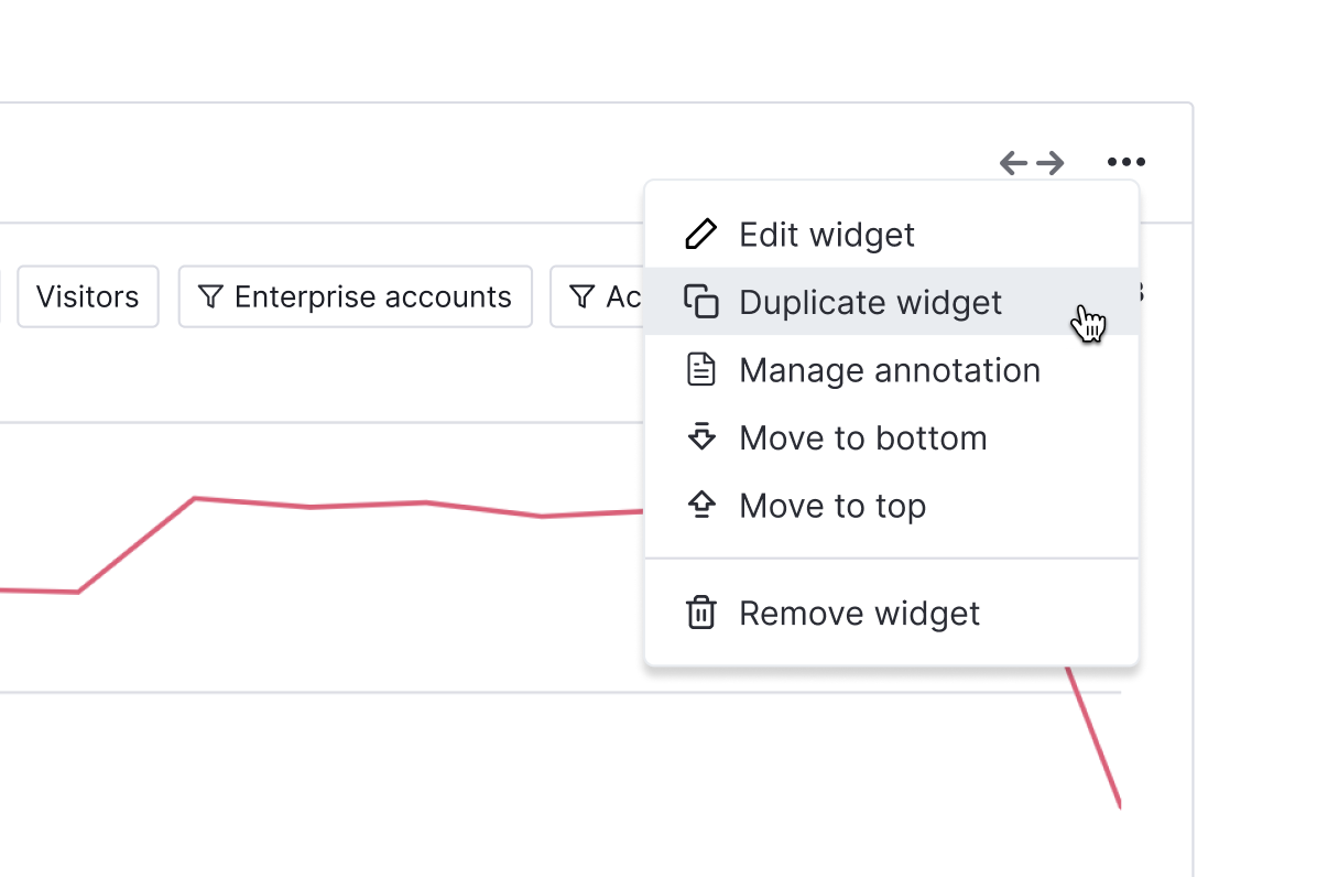
Duplicate your widgets
Duplicate a widget on a dashboard without having to go into the widget catalogue and add it. Once duplicated, you’ll get the widget settings pre-filled with the previous selections, so you can change settings as needed. This is especially helpful for text widgets, if you want to copy all the same formatting.
Updated data vis colors
In coming months, you will notice a little ✨ glow-up ✨ to our data visualization colors. It will align more with our brand and new navigation, and will help you more clearly interpret your data.
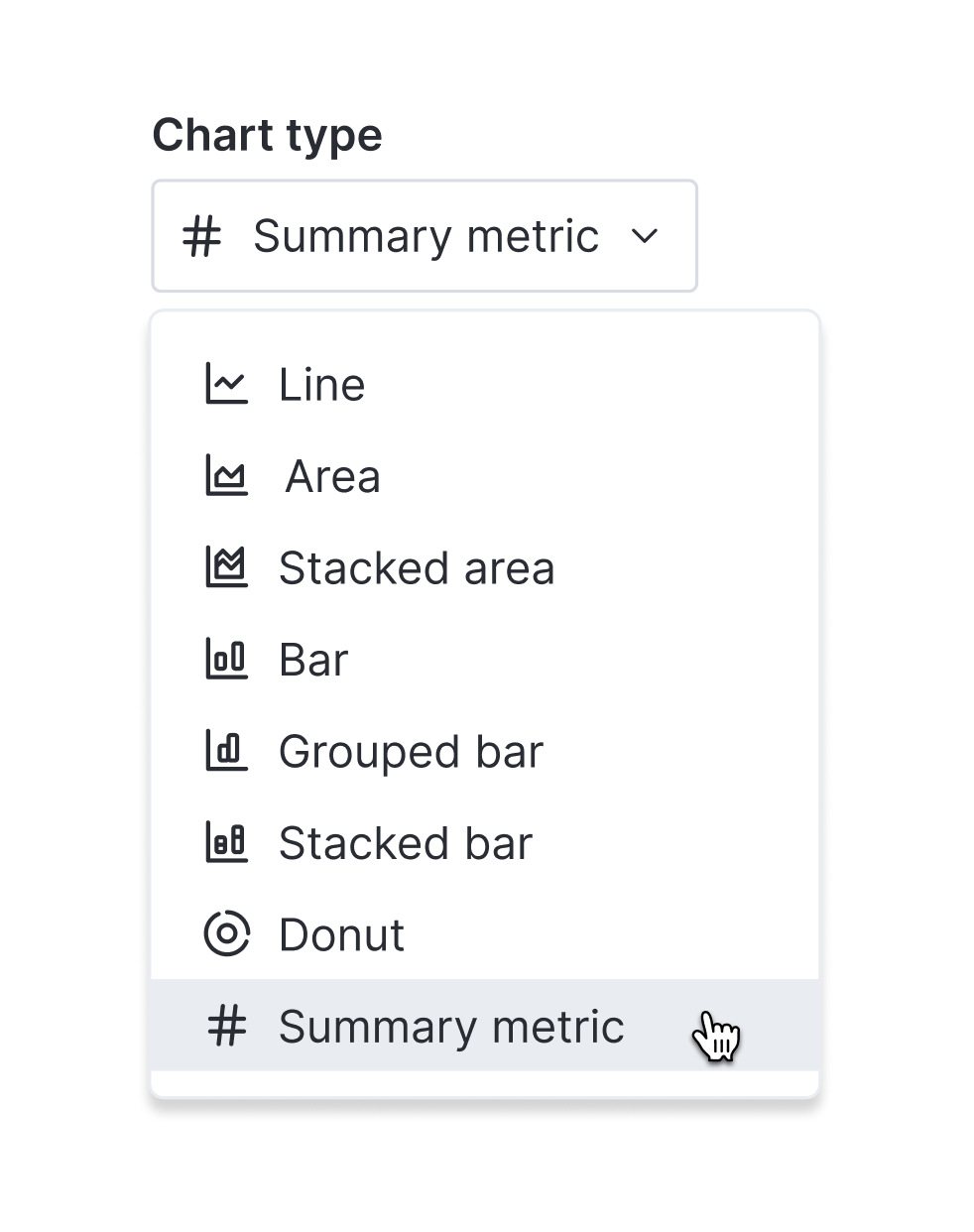
Summary metric chart type
Get at-a-glance insights in Data Explorer and on dashboards that scales with your data. The most requested chart type is coming soon.
